
Warning
Versions below v1.0.0 have been deprecated. Please upgrade to version v1.0.0 or above as soon as possible.
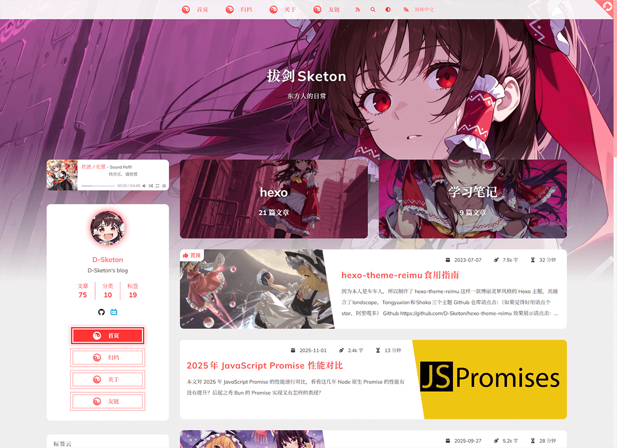
A Hakurei Reimu style Hexo theme.
A combination of landscape、Tangyuxian and Shoka themes.
| framework | repository | version | stars |
|---|---|---|---|
| Hexo | hexo-theme-reimu |  |
 |
| Hugo | hugo-theme-reimu |  |
 |
| Astro | astro-theme-reimu |  |
 |
Issues and PRs welcome!
- ✨ Full blog functionality
- 🔄 Compatible with Hexo 6+
- 📱 Responsive layout
- 🌙 Dark mode support
🅰️ i18n support
- 🖥️ Code highlighting & copying
- ➗ KaTeX / MathJax3 math formula support
- 📊 Mermaid flowchart support
- 🔍 Algolia search integration
- 🔍 Local search integration
- 💬 Multiple comment systems support:
- Valine
- Waline
- Twikoo
- Gitalk
- Giscus
- Disqus
- Utterances
- Beaudar
- 📊 Article reading statistics (Valine / Waline)
- 👥 Visitor statistics (Busuanzi)
- 🎵 Music player support:
- Aplayer
- Meting
- 🖼️ Lazy loading for images
- ⚡ Loading animations
- 🖱️ Mouse effects:
- Animation effects
- Reimu cursor style
- 👾 Live2D / Live2D-widgets integration
- 📑 Table of Contents
- 🔄 PJAX support
- 🔧 ServiceWorker implementation
- 📰 RSS feed
- 🎨 Icon support:
- Iconfont
- FontAwesome7
- 🔗 Built-in tag plugins:
- Internal links
- External links
- Friend links
- Heatmap
- Tag Roulette
- Tabs
- Gallery
- 🎨 Dynamic theme color adaptation
- 🎨 Custom Containers
- ©️ Article copyright declaration
- 🌐 Custom CDN source configuration
- 📜 Custom Font Family
- 🎨 Share card functionality
For beginners, you can directly use reimu-template. It comes pre-installed with hexo, hexo-theme-reimu and other functional packages. You only need to clone the repository, install dependencies, and modify the configuration to get a basic blog!
Using npm
npm install hexo-theme-reimu --saveOr clone this repository directly to the /themes folder and rename it to reimu
git clone https://github.com/D-Sketon/hexo-theme-reimu.gitAnd modify the theme in _config.yml
theme: reimuBasic structure
To ensure correct display, please refer to _example and create _data, about, and friend folders in source (Note: This is the source folder in your blog's root directory, not the one in the theme!)
Directory Structure Example:
source/
├── images/
│   └── favicon.ico        # Website favicon
├── _data/
│   ├── avatar/
│   │   └── avatar.webp    # Avatar file
│   ├── covers.yml         # Article cover URL list
│   └── covers/            # Article cover folder
├── about/                 # About page
│   └── index.md
├── friend/                # Friend links page
│   ├── index.md
│   └── _data.yml          # Friend links data
└── _posts/                # Posts folder
    └── xxxx.md
- The
avatarfolder stores the author's avatar, default namedavatar.webp. You can configure it in the inner_config.ymlas follows:
avatar: "avatar.webp" # By default, it looks for the avatar in the avatar folder. Do not include the path, or it will result in a 404 error- The
coversfolder stores article cover images - The
covers.ymlstores article cover URLs
index.md serves as the About page
index.md serves as the Friends page. Fill in friend link information in _data.yml to display corresponding friend cards on the page
Cover Images, Banner and Favicon
The display logic of banner and cover is as follows:
- The post header image prefers Front-matter
banner; ifbanneris not set, it falls back tocoverfor compatibility. - When both
bannerandcoverare not set, the post header image uses globalcoverin the inner_config.yml, then falls back to globalbanner. - The list card cover prefers Front-matter
cover(URL only). Ifcoveris not set,false, orrgb(...), it falls back to random images fromsource/_data/coversandsource/_data/covers.yml. - If random covers are unavailable, it falls back to global
banner.
Recommended usage (separate header image and card cover):
---
title: Hello World
banner: https://example.com/post-header.webp
cover: https://example.com/post-card.webp
---
Legacy-compatible usage (cover only):
---
title: Hello World
cover: https://example.com/cover.webp
---The banner image is stored at themes/reimu/source/images/banner.webp, and can be modified in the inner _config.yml:
banner: "/images/banner.webp"The favicon is stored at themes/reimu/source/images/favicon.ico, and can be modified in the inner _config.yml:
favicon: "/images/favicon.ico"Add sticky: true to the article's Front-matter to pin it:
---
title: Hello World
sticky: true
---Disabled by default. You can choose to display the article summary in the subtitle or at the beginning of the article.
summary:
  enable: false
  style: 'subtitle' # 'subtitle' or 'blockquote'
Sidebar
Default on the right. You can modify it in the inner _config.yml.
sidebar:
  position: right # left | right | false
  menu: true # whether to show the sidebar menu button, ignored on mobile devices
  article:
    show_common: true # whether to show common sidebar on article pages, ignored on mobile devices
Additionally, you can control it through the article's Front-matter, which takes precedence over the global configuration.
---
sidebar: left # left | right | false
---
When sidebar is set to false, the sidebar will be hidden, and the aplayer player and widgets will not be displayed at the same time.
Default enabled. You can modify it in the inner _config.yml.
toc: true # true | falseAdditionally, you can control it through the article's Front-matter, which takes precedence over the global configuration.
---
toc: true # true | false
---
You can also configure the behavior of the TOC through the following configuration:
toc_options:
  list_number: true # Whether to display the list number
  min_depth: 1 # Minimum depth
max_depth: 6 # Maximum depthYou can configure the social links in the sidebar in the inner _config.yml.
social:
  github: https://github.com/yourname
  bilibili: https://space.bilibili.com/yourname
  # weixin: https://example.com/your-weixin-link
  # qq: https://example.com/your-qq-link
tiktok: https://www.tiktok.com/@yournameYou can configure the widgets in the sidebar in the inner _config.yml.
widgets:
  # - category
  # - tag
  # - tagcloud
  # - archive
  # - recent_posts
You can also configure the behavior of the widgets through the following configuration:
archive_type: "monthly" # monthly | yearly, archive type
show_count: false # whether to show count in archive
tag_limits:
recent_posts_limits: 5
tagcloud_limits:
only_show_capsule_in_index: false # show all category/tag capsules only on archive index to improve build performance for large taxonomies
uppercase_capsule: true # whether to transform category/tag capsules to uppercase
show_update_time: false # whether to display article update time
Footer
The footer section allows you to configure basic display information and statistics.
footer:
  since: 2020 # The starting year displayed in the copyright information (e.g., 2020-current year)
  powered: true # Whether to display copyright information
  count: true # Whether to display word count and reading time statistics
busuanzi: true # Whether to enable Busuanzi visitor counting statisticsFor websites hosted in mainland China, you can display ICP filing information as required by regulations.
icp:
  icpnumber: # ICP filing number
  beian: # Public Security Bureau filing number
recordcode: # Record code parameter from the Public Security Bureau filing linkmoe_icp:
icpnumber: # Moe ICP filing numberCode Blocks
To ensure proper display of code blocks, make sure your outer _config.yml has the following configuration:
(Hexo <7.0.0)
highlight:
  enable: true
  wrap: true
  hljs: false
prismjs:
  enable: false
(Hexo >=7.0.0)
syntax_highlighter: highlight.js
highlight:
  wrap: true
  hljs: false
Code blocks also provide a code copying feature - click the copy button in the top right corner of the code block to copy the code. You can configure the copy functionality in the inner _config.yml.
success is the prompt shown when copying is successful, fail is shown when copying fails. Additionally, you can configure copyright notices - when the copied text exceeds count characters, the copyright notice will be added after the copied content.
clipboard:
  success:
    en: Copy successfully (*^▽^*)
    zh-CN: 复制成功 (*^▽^*)
    zh-TW: 複製成功 (*^▽^*)
    ja: コピー成功 (*^▽^*)
  fail:
    en: Copy failed (゚⊿゚)ツ
    zh-CN: 复制失败 (゚⊿゚)ツ
    zh-TW: 複製失敗 (゚⊿゚)ツ
    ja: コピー失敗 (゚⊿゚)ツ
  copyright:
    enable: false
    count: 50 # Add copyright notice when character count exceeds this number
    license_type: by-nc-sa # https://creativecommons.org/licenses
v1.1.0 added configuration to control the default expansion state of code blocks. expand can be set to true, false, or a number - the number indicates that code blocks will be collapsed by default when the number of lines exceeds this value.
code_block:
  expand: true # true | false | number
Site comments
Site comments can be individually controlled for each article using
commentsin the Front-matter.
Whencommentsisfalse, comments won't be displayed. When it'strueor not specified, the display will be determined by the_config.ymlconfiguration.
Support for multiple comment systems simultaneously after version 1.7.0+
Global comment system configuration:
comment:
  title: Say something! # Title of the comment box
  default: waline # Default comment system used when multiple are enabled
If using Valine
Please refer to their official documentation to complete the LeanCloud configuration, then set valine.enable to true in the inner _config.yml and fill in your appId and appKey
valine:
  enable: true
  appId: "your appId"
  appKey: "your appKey"
  pageSize: 10 # comment list page size
  avatar: mp # gravatar style https://valine.js.org/#/avatar
  # lang: zh-cn # deprecated, use html.lang instead
  placeholder: Just go go # valine comment input placeholder(like: Please leave your footprints )
  guest_info: nick,mail,link #valine comment header info
  recordIP: true # whether to record the IP address of the commenters
  highlight: true # whether to highlight the code blocks
  visitor: false # whether to display the number of visitors
  serverURLs: # leancloud server url
If using Waline
Please refer to their official documentation to complete the LeanCloud configuration, then set waline.enable to true in the inner _config.yml and fill in your serverURL
waline:
  enable: true
  serverURL: "your server url"
  locale: {} # https://waline.js.org/guide/features/i18n.html#%E8%87%AA%E5%AE%9A%E4%B9%89%E8%AF%AD%E8%A8%80
  emoji:
    - https://unpkg.com/@waline/emojis@1.2.0/weibo
    - https://unpkg.com/@waline/emojis@1.2.0/alus
    - https://unpkg.com/@waline/emojis@1.2.0/bilibili
    - https://unpkg.com/@waline/emojis@1.2.0/qq
    - https://unpkg.com/@waline/emojis@1.2.0/tieba
    - https://unpkg.com/@waline/emojis@1.2.0/tw-emoji
  meta:
    - nick
    - mail
    - link
  requiredMeta:
    - nick
    - mail
  wordLimit: 0
  pageSize: 10
  pageview: true
If using twikoo
Please refer to their official documentation to complete Tencent Cloud or Vercel deployment, then set twikoo.enable to true in the inner _config.yml and fill in your envId
twikoo:
  enable: true
  envId: # For Tencent Cloud environment, fill in envId; For Vercel environment, fill in the URL (https://xxx.vercel.app)
  region:
If using giscus
Please refer to the documentation to complete repository configuration, then set giscus.enable to true in the inner _config.yml and fill in the corresponding data
giscus:
  enable: true
  repo: "your repo"
  repoId: "your repoId"
  category: "your category"
  categoryId: "your categoryId"
  mapping: mapping
  strict: 0
  reactionsEnabled: 1
  emitMetadata: 0
  inputPosition: bottom
  theme:
    light: # optional, supports giscus built-in theme names or custom CSS URL
    dark: # optional, supports giscus built-in theme names or custom CSS URL
Notes:
- Giscus is rendered in an iframe and cannot directly inherit global site styles, so theme is controlled via
data-theme. - If
theme.light/theme.darkuse URLs, the theme checks whether the URL allows CORS fromhttps://giscus.app; if validation fails, it automatically falls back to built-inlight/dark. - If both
themevalues are empty, the theme tries built-in Reimu-style CSS (matching cursor style, fonts, and static tokens; dynamic tokens such asmaterial_themeare not supported). - Local
hexo s(HTTP and usually without CORS headers) and default static resources ongithub.iousually cannot pass URL-theme validation directly; use a resource domain with configurable CORS (for example, jsDelivr proxy).
If using gitalk
Please refer to their official documentation to complete repository configuration, then set gitalk.enable to true in the inner _config.yml and fill in the corresponding data
gitalk:
  enable: true
  clientID: "your application client ID"
  clientSecret: "your application client secret"
  repo: "your repo"
  owner: "repo owner"
  admin: "repo owner and collaborators"
  md5: false # Whether to use md5 to encrypt the path
If using Disqus
Please set disqus.enable to true in the inner _config.yml, and fill in your shortname
disqus:
  enable: true
  shortname: "your shortname"
  count: true # Whether to enable comment count statistics
If using utterances
Please set utterances.enable to true in your theme's _config.yml and fill in your own repo
utterances:
  enable: true
  repo: owner/repo # Change this to "Your GitHub Username/The Repository Name" used for storing blog comments
  issue_term: title
  theme: github-light # You can use auto to automatically adapt to dark and light themes
If using beaudar
Please set beaudar.enable to true in your theme's _config.yml and fill in your own repo and branch. Then create the domain whitelist in your repository (for Hexo themes, please place this file directly in the source directory) and authorize the installation
beaudar:
  enable: true
  repo: owner/repo # Change this to "Your GitHub Username/The Repository Name" used for storing blog comments
  branch: main # Change this to your repository branch name
  issue_term: title # Mapping between blog posts and Issues
  issue_number:
  theme: auto # You can use auto to automatically adapt to dark and light themes
  label:
  input_position: top # top/bottom - Position of the comment box, default is top
  comment_order: desc # asc/desc - Comment sorting order, default is desc (newest comments on top)
  keep_theme: # true/false - Save theme settings to the page's sessionStorage, default is true
  loading: # true/false - Clicking the loading icon redirects to the official page
Site search
Note: Do not enable both Algolia search and local search at the same time.
If choosing Algolia, please install @reimujs/hexo-algoliasearch
npm install @reimujs/hexo-algoliasearch --saveThen refer to its README to complete the Algolia account configuration, and add the following configuration to the outer _config.yml
Note: The search redirect link is a permanent link, so please ensure the
urlin the outer_config.ymlis filled in correctly.
algolia:
  appId: "your applicationID"
  apiKey: "your apiKey"
  adminApiKey: "your adminApiKey"
  indexName: "your indexName"
  chunkSize: 5000
  fields:
    - content:strip:truncate,0,500
    - excerpt:strip
    - gallery
    - permalink
    - photos
    - slug
    - tags
    - title
In the inner _config.yml, set algolia_search.enable to true
algolia_search:
  enable: true
And run the following command to generate the search index
hexo algoliaAfter version 1.5.0, the theme has built-in
hexo-generator-search, so there is no need to installhexo-generator-searchseparately.
This theme comes with hexo-generator-search built-in. If you choose to use local search, please set generator_search.enable to true in the inner _config.yml. For other configurations, refer to hexo-generator-search.
generator_search:
  enable: true
  field: post
  content: true
Mathematical formulas
Please install @reimujs/hexo-renderer-markdown-it-plus
npm uninstall hexo-renderer-marked --save
npm install @reimujs/hexo-renderer-markdown-it-plus --save
Mathematical formula support is disabled by default. To enable it, set math.enable to true in the inner _config.yml
Note: Do not enable both KaTeX and MathJax3 at the same time.
For server-side rendering, set math.katex.enable to true in the inner _config.yml
math:
  enable: true
  katex:
    enable: true
    autoRender: false
For client-side rendering, set both math.katex.enable and autoRender to true in the inner _config.yml
math:
  enable: true
  katex:
    enable: true
    autoRender: true
Add the following configuration to the outer _config.yml
markdown_it_plus:
rawLaTeX: trueTo use MathJax3, set math.mathjax.enable to true in the inner _config.yml
math:
  enable: true
  mathjax:
    enable: true
    options: # MathJax3 Options
Add the following configuration to the outer _config.yml
markdown_it_plus:
  rawLaTeX: true
Mermaid Diagrams
Please install hexo-filter-mermaid-diagrams
npm install hexo-filter-mermaid-diagrams --saveSet mermaid.enable to true in the inner _config.yml
mermaid:
  enable: true
  zoom: false # whether to enable zoom
And add mermaid: true to the Front-matter of any article where you want to use mermaid diagrams
---
title: Hello World
mermaid: true
---
RSS
Please install hexo-generator-feed
npm install hexo-generator-feed --saveRefer to its README to complete the feed configuration in the outer _config.yml
Then add the generated xml path to the inner _config.yml
rss: atom.xmli18n
This theme provides five languages by default: en, zh-CN, zh-TW, ja and pt-BR. You can switch the language by modifying the language in the outer _config.yml.
language: zh-CNThe following is an experimental feature and may contain bugs.
v1.4.0+ experimentally introduced hexo-generator-i18n and added multi-language switching functionality. You can configure i18n in the inner _config.yml to add custom languages. The configuration can be referenced from hexo-generator-i18n:
i18n:
  enable: false # false | true
  type: [page, post]
  generator: [archive, category, tag, index]
  languages: [zh-CN, en] # List of languages, the first one is the default language
For multilingual support in posts, you can add lang in the Front-matter to specify languages other than the default language (the default language does not need to be added).
lang: enThe above will generate a page at /en/:permalink.
For multilingual support in pages, you can directly create a folder for the corresponding language in the source directory and place an index.md file inside it, such as source/en/about/index.md. This will generate a page at /en/about.
For more information, please refer to How to add multi-language support to Hexo
Icon
By default, this theme uses its own provided iconfont (v0.1.3+)
icon_font: 4552607_0khxww3tj3q9If you want to continue using fontawesome icons, set icon_font to false. This will use the corresponding fontawesome from the vendor
fontawesome:
  high_priority:
    - src: webcache|@fortawesome/fontawesome-free@7.1.0/css/regular.min.css
      integrity: sha384-4qYppzjH8EiA+cGdaubu2vL7Rk8WGiqCSj7oRuP1uwtFWkfKNHD20lPfcrbQc8dU
    - src: webcache|@fortawesome/fontawesome-free@7.1.0/css/solid.min.css
      integrity: sha384-wbMWab3UDSPm2kvIgVOn/d9KPTecgPU1+Nb3zoQrm/oVu0EkPL6IaKinjbwW0rum
  low_priority:
    - src: webcache|@fortawesome/fontawesome-free@7.1.0/css/brands.min.css
      integrity: sha384-KTGeC2hIMzpeQakhsmzB9bZfhCD5xZZCgI1iZH6f/O457SxzlkzTQg/WXFNoi3ih
    - src: webcache|@fortawesome/fontawesome-free@7.1.0/css/v5-font-face.min.css
      integrity: sha384-nJ1ThfldViXoLpJ6jlKcP2beas8BMbYq26SG9Hi8cH89bZi4RZ644v7helMCqJxd
    - src: webcache|@fortawesome/fontawesome-free@7.1.0/css/v4-font-face.min.css
      integrity: sha384-UlkrhOIvZxJFd4MElSUp7ow6/RUeYKi/orfCZIRRiOENFuQPIAA3T3HjYfmBRhNq
Extended features
Enabled by default
top:
  enable: true
position: right # left | rightThe default setting is auto, which automatically switches based on the user's system settings. It can be set to true or false to change the default state.
dark_mode:
  # true means that the dark mode is enabled by default
  # false means that the dark mode is disabled by default
  # auto means that the dark mode is automatically switched according to the system settings
enable: auto # true | false | autoDisabled by default, supports Baidu Analytics, Google Analytics and Microsoft Clarity
baidu_analytics: false
google_analytics: false
clarity: falseEnabled by default
pace:
enable: trueEnabled by default
firework:
  enable: true
  disable_on_mobile: false # whether to disable on mobile devices, which can improve performance
  options: # mouse-firework options
For detailed configuration, please check mouse-firework
Disabled by default
pjax:
  enable: false
PJAX cannot be used with
relative_link: true!
Disabled by default
service_worker:
enable: falseDisabled by default
live2d:
  enable: false
position: left # left | rightDisabled by default
live2d_widgets:
  enable: false
position: left # left | rightEnabled by default
reimu_cursor:
  enable: true
  cursor:
    default: ../images/cursor/reimu-cursor-default.png
    pointer: ../images/cursor/reimu-cursor-pointer.png
text: ../images/cursor/reimu-cursor-text.pngDisabled by default. When enabled and provided with corresponding image sizes and media queries, it can improve mobile LCP performance
banner_srcset:
  enable: false
  srcset:
    - src: "/images/banner-600w.webp"
      media: "(max-width: 479px)"
    - src: "/images/banner-800w.webp"
      media: "(max-width: 799px)"
    - src:
        - "/images/banner.avif"
        - "/images/banner.webp" # support array format
media: "(min-width: 800px)"Disabled by default
article_copyright:
  enable: false # Display copyright card?
  content:
    author: # true | false Show author in copyright card?
    link: # true | false Show link in copyright card?
    title: # true | false Show title in copyright card?
    date: # true | false Show creation date in copyright card?
    updated: # true | false Show update date in copyright card?
    license: # true | false Show license in copyright card?
    license_type: by-nc-sa # https://creativecommons.org/licenses
Additionally, this can be controlled through article Front-matter, which takes precedence over global configuration
---
copyright: true # Display copyright card?
---Disabled by default. When enabled, it preloads links while users stay on the page to improve user experience
quicklink:
  enable: false
  timeout: 3000 # Preload timeout
  priority: true # Whether to prioritize loading the page
ignores: [] # Ignore the specified link, supports string array onlyDisabled by default
outdate:
  enable: false
  daysAgo: 180 # How many days old before an article is considered outdated
  message:
    en: This article was last updated on {time}. Please note that the content may no longer be applicable.
    zh-CN: 本文最后更新于 {time},请注意文中内容可能已不适用。
    zh-TW: 本文最後更新於 {time},請注意文中內容可能已不適用。
ja: この記事は最終更新日:{time}。記載内容が現在有効でない可能性がありますのでご注意ください。Disabled by default
sponsor:
  enable: false # Display sponsorship QR code?
  tip: # Sponsorship prompt
    zh-CN: 请作者喝杯咖啡吧
    zh-TW: 請作者喝杯咖啡吧
    en: Buy me a coffee
    ja: コーヒーを買ってください
  icon:
    url: "../images/taichi.png" # Sponsorship icon, path relative to css/style.css, so need to go up one level to find images folder
    rotate: true # Rotate icon?
    mask: true # Use image as mask (only show PNG image outline)?
  qr:
    - name: Alipay # QR code name
      src: "/sponsor/alipay.jpg" # QR code path, please fill in yourself
Additionally, this can be controlled through article Front-matter, which takes precedence over global configuration
---
sponsor: true # Display sponsorship QR code?
---Disabled by default. When enabled, displays category cards on homepage as an alternative to widget categories
home_categories:
  enable: false # Display home categories card?
  content:
    - categories: # Category name, format matches categories in Front-matter, can be string (single-level) or array (multi-level)
      cover: # Card cover, uses random cover if not specified
    - categories:
cover:It's recommended to enable PJAX first, otherwise the player may auto-pause
Uses Aplayer + Meting (optional), disabled by default
Default is after sidebar
player:
  disable_on_mobile: false # whether to disable player on mobile for better performance
position: before_sidebar # before_sidebar / after_sidebar / after_widgetSet player.aplayer.enable to true and configure player.aplayer.options according to Aplayer Docs
player:
  aplayer:
    enable: true
    options:
      audio: [] # audio list
      fixed:
      autoplay:
      loop:
      order:
      preload:
      volume:
      mutex:
      listFolded:
lrcType:Set both player.aplayer.enable and player.meting.enable to true, configure player.meting.options according to Meting Docs, player.aplayer.options is for Aplayer configuration
player:
  aplayer:
    enable: true
    options:
      audio: [] # this option will be overwritten by meting
      fixed:
      autoplay:
      loop:
      order:
      preload:
      volume:
      mutex:
      listFolded:
      lrcType:
  meting:
    enable: true
    meting_api: # custom api
    options:
      id:
      server:
      type:
auto:Disabled by default, currently supports facebook, twitter, linkedin, reddit, weibo, qq, weixin.
share:
  # - facebook
  # - twitter
  # - linkedin
  # - reddit
  # - weibo
  # - qq
  # - weixin
For weixin, it generates a share card with QR code that can be saved locally and shared to WeChat Moments (Note: when the article cover has cross-origin issues, snapdom cannot correctly generate cards with images!)
Used to inject custom code, similar to Hexo#Injector, supports head, body and sidebar injection
injector:
  head_begin: # Inject code snippet right after <head>
  head_end: # Inject code snippet right before </head>
  body_begin: # Inject code snippet right after <body>
  body_end: # Inject code snippet right before </body>
  sidebar_begin: # Inject code snippet right after <aside>
sidebar_end: # Inject code snippet right before </aside>Disabled by default. When enabled, it will display a triangle badge in the upper right corner, supporting custom links and icons.
triangle_badge:
  enable: false
  icon: github # Same as the icon in the social config
  link: https://github.com/D-Sketon/hexo-theme-reimu
Built-in Tag Plugins
{% friendsLink path %}The first parameter path indicates the path to the friend links yaml file
{% postLinkCard slug [cover]|"auto" [escape] %}Not recommended to use this tag. It is advised to use the link tag instead.
The first parameter is the article's slug; the second parameter (optional) is the cover image displayed on the card, if set to auto it will automatically use the blog's banner; the third parameter (optional) indicates whether the article title should be escaped
Slug generation algorithm: https://github.com/hexojs/hexo-util/blob/master/lib/slugize.ts In simple terms, it removes invisible characters from the article title and replaces special characters
\s~!@#$%^&*()\-_+=[]{}|\;:"'<>,.?/with the separator-, merges consecutive separators and removes leading/trailing separators
{% externalLinkCard title link [cover]|"auto" %}Not recommended to use this tag. It is advised to use the link tag instead.
The first parameter is the article title; the second parameter is the external link to the article; the third parameter (optional) is the cover image displayed on the card, if set to auto it will automatically use the default cover
{% heatMapCard levelStandard %}The first parameter is the level standard for the heatmap (graded based on the word count of the articles), with the default value being "1000,5000,10000".
{% tagRoulette tags icon %}tagRoulette is an interactive element that provides a random tag display feature. When the button is clicked, a tag is randomly selected and displayed from a predefined pool of tags.
- tags: Optional parameter specifying the tag pool. Multiple tags should be separated by English commas (,). If not provided, a few example tags will be used by default. Example: "memory decline, loss of expression, increased laziness, numbness, so sleepy"
- icon: Optional parameter to customize the trigger button's icon. Default: 🕹️ (game controller emoji). Can be replaced with any emoji or text, such as 🎲, 🎯, 🔄, etc.
{% link slug|title [title] [cover]|"auto" [escape] %}Upgraded version of externalLinkCard and postLinkCard. It is recommended to use this tag.
The first parameter is the slug of the article or the title of the external link;
The second parameter (optional) is the title displayed on the card;
The third parameter (optional) is the cover image displayed on the card. If set to auto, the blog's banner or default cover will be used automatically;
The fourth parameter (optional) indicates whether the article title is escaped.
{% tabs [activeTab] ["center"] %}
<!-- tabName -->
Tab content
<!-- tabName -->
Tab content
{% endtabs %}
Adapted from the next, volantis, and stellar themes, this feature supports creating tabbed switching effects within articles.
- activeTab: Optional parameter, specifies the default active tab index (counting starts from 1). Default is 1.
- "center": Optional parameter, specifies that tab titles should be center-aligned. Default is left-aligned.
- tabName: The title of each tab, must be wrapped in
<!-- tabName -->. Supports displaying icons using@+ icon hexadecimal code. Examples:- Title only:
<!-- Title --> - Icon only:
<!-- @e60c --> - Icon + Title:
<!-- Title@e60c -->
- Title only:
{% gallery %}


...
{% endgallery %}Display multiple images in a photo wall format, supporting automatic arrangement and responsive layout.
{% grid [width] [col] %}
<!-- cell -->
Content 1
<!-- cell -->
Content 2
<!-- cell -->
Content 3
{% endgrid %}
Display content in a grid layout with responsive design.
- width: Optional parameter, sets the minimum column width, e.g.,
300means a minimum column width of 300px. Default is240 - col: Optional parameter, sets a fixed number of columns, e.g.,
col:3means a fixed 3-column layout. Default is auto column count - Use
<!-- cell -->to separate each grid cell, and each cell's content will be rendered independently
{% alertBlockquote [type] [title] %}
Quote content
{% endalertBlockquote %}
Fallback version of the custom container, suitable for renderers that do not support custom containers.
- type: Optional parameter, specifies the warning type, optional values are
info,tip,important,warning,danger, default isinfo - title: Optional parameter, specifies the warning title, if not provided, the default title will be used
{% details [summary] %}
Details content
{% enddetails %}
Fallback version of the custom container, suitable for renderers that do not support custom containers.
- summary: Optional parameter, specifies the details title, if not provided, the default title will be used
Custom Containers
This theme provides custom container functionality similar to VitePress. Before using it, you need to install @reimujs/hexo-renderer-markdown-it-plus.
Usage is as follows:
::: info
This is an info box.
:::

::: tip
This is a tip.
:::

::: important
This is an important box.
:::

::: warning
This is a warning.
:::

::: danger
This is a dangerous warning.
:::

::: danger STOP
Danger zone, do not proceed
:::

::: details INFO
This is a details block.
:::
Customize theme
The hexo-theme-reimu theme supports extensive customization. You can customize your theme by modifying _config.yml.
Disabled by default. When enabled, it dynamically generates theme colors based on the dominant color of the article's banner image, following Google's Material You design guidelines.
material_theme:
  enable: false # true | false
Note: When this feature is enabled, the
crossorigin="anonymous"attribute will be added to theimgelement of the banner to fetch the dominant color of the image. Please ensure your image server supports cross-origin access or use a third-party image proxy.
The hexo-theme-reimu theme supports theme color customization through CSS variables. You can customize your theme colors by modifying CSS variables under the :root pseudo-class.
v1.8.0 added internal_theme configuration to customize theme colors. You can change the theme colors by modifying the internal_theme configuration in _config.yml. The default theme colors are as follows:
internal_theme:
  light:
    --red-0: "#ff0000"
    --red-1: "#ff5252"
    --red-2: "#ff7c7c"
    --red-3: "#ffafaf"
    --red-4: "#ffd0d0"
    --red-5: "#ffecec"
    --red-5-5: "#fff3f3"
    --red-6: "#fff7f7"
    --color-red-6-shadow: "rgba(255, 78, 78, 0.6)"
    --color-red-3-shadow: "rgba(255, 78, 78, 0.3)"

    --highlight-nav: "#f5f5f5"
    --highlight-scrollbar: "#d6d6d6"
    --highlight-background: "#fdfdfd"
    --highlight-selection: "#e9e9e988"
    --highlight-foreground: "#24292e"
    --highlight-comment: "#7d7d7d"
    --highlight-red: "#d73a49"
    --highlight-orange: "#e36209"
    --highlight-yellow: "#cb911d"
    --highlight-green: "#22863a"
    --highlight-aqua: "#005cc5"
    --highlight-blue: "#032f62"
    --highlight-purple: "#6f42c1"
    --highlight-deletion: "#b31d28"
    --highlight-deletion-bg: "#ffeef0"
    --highlight-addition: "#22863a"
    --highlight-addition-bg: "#f0fff4"
  dark:
    --red-4: "rgba(255, 208, 208, 0.5)"
    --red-5: "rgba(255,228,228,0.15)"
    --red-5-5: "rgba(255,236,236,0.05)"
    --red-6: "rgba(255, 243, 243, 0.2)"

    --highlight-nav: "#222830"
    --highlight-scrollbar: "#454d59"
    --highlight-background: "#1e2027"
    --highlight-selection: "#51515155"
    --highlight-foreground: "#c9d1d9"
    --highlight-comment: "#8b949e"
    --highlight-red: "#ff7b72"
    --highlight-orange: "#ffa657"
    --highlight-yellow: "#ffcc66"
    --highlight-green: "#7ee787"
    --highlight-aqua: "#a5d6ff"
    --highlight-blue: "#79c0ff"
    --highlight-purple: "#d2a8ff"
    --highlight-deletion: "#ffa198"
    --highlight-deletion-bg: "#490202"
    --highlight-addition: "#7ee787"
--highlight-addition-bg: "#04260f"You can define Google Fonts through the following configuration:
# https://fonts.google.com/
font:
  enable: true # Enable Google Fonts
  article:
    - Mulish
    - Noto Serif SC
  code:
    # - Ubuntu Mono
    # - Source Code Pro
    # - JetBrains Mono
v1.1.0 added local_font configuration for defining local fonts, which has lower priority than Google Fonts:
local_font:
  article:
    - "-apple-system"
    - PingFang SC
    - Microsoft YaHei
    - sans-serif
  code:
    - Menlo
    - Monaco
    - Consolas
    - monospace
v1.8.0 added custom_font configuration for defining custom fonts, which has the highest priority:
custom_font:
  enable: true
  article:
    - css: https://fontsapi.zeoseven.com/292/main/result.css # font css
      name: LXGW WenKai # font name
code:v1.0.0 underwent significant refactoring and exposed many configurations for changing the original icons
The menu configuration structure changed in v1.0.0, allowing users to customize icons. When icon is empty, it defaults to the Taichi icon. You can fill in a hexadecimal number to customize the icon, supporting both FontAwesome, icon font and false.
v1.8.4 icons support image paths, such as /avatar/avatar.webp.
menu:
  - name: home
    url: /
    icon: # Defaults to Taichi icon when empty
  - name: archives
    url: /archives
    icon: f0c1 # You can fill in a hexadecimal number to customize the icon, supports FontAwesome and icon font. If set to false, no icon will be displayed.
  - name: about
    url: /about
    icon:
  - name: friend
    url: /friend
icon:v1.0.0 added icon configuration to footer, top, and sponsor configurations for customizing icons.
urlis the path to the icon, relative tocss/style.css, so you need to go up one level to find the images folder.rotatedetermines whether to rotate the icon, defaults totrue.maskdetermines whether to use the image as a mask (only showing PNG image outline), defaults totrue.
footer:
  icon:
    url: "../images/taichi.png" # If set to false, no icon will be displayed
    rotate: true
    mask: true

top:
  icon:
    url: "../images/taichi.png"
    rotate: true
    mask: true

sponsor:
  icon:
    url: "../images/taichi.png" # If set to false, no icon will be displayed
    rotate: true
mask: truev1.0.0 added icon configuration to preloader for customizing the loading icon. When icon is empty, it defaults to using inline SVG (ensuring first-screen loading speed). You can enter a link to customize the loading icon.
It's not recommended to use oversized icons to avoid affecting loading speed.
preloader:
  enable: true
  text:
    zh-CN: 少女祈祷中...
    zh-TW: 少女祈禱中...
    en: Loading...
    ja: 少女祈祷中...
  icon: # if the icon is empty, the default svg is used, which is inlined to ensure the loading speed of the first screen. You can fill in a link to customize the loading icon, such as '/images/taichi.png'
rotate: truev1.0.0 added anchor_icon configuration for customizing anchor icons, defaults to using the # icon. You can fill in a hexadecimal number to customize the icon, supporting both FontAwesome and icon font.
anchor_icon: # if the icon is empty, the default # icon is usedv1.8.5 anchor_icon supports passing false to hide anchor icon.
v1.3.0 added reimu_cursor.cursor configuration for customizing cursor icons. You can fill in a path relative to css/style.css to customize cursor icons.
reimu_cursor:
  enable: true
  cursor:
    default: ../images/cursor/reimu-cursor-default.png
    pointer: ../images/cursor/reimu-cursor-pointer.png
text: ../images/cursor/reimu-cursor-text.pngBased on AOS.js scroll animation effects, default is true, you can enable or disable through the following configuration, and set different animation effects for different pages.
animation:
  enable: true
  options:
    header:
    home:
    article:
    archive:
Available Animation Effects:
- Fade: fade, fade-up, fade-down, fade-left, fade-right, fade-up-right, fade-up-left, fade-down-right, fade-down-left
- Flip: flip-up, flip-down, flip-left, flip-right
- Slide: slide-up, slide-down, slide-left, slide-right
- Zoom: zoom-in, zoom-in-up, zoom-in-down, zoom-in-left, zoom-in-right, zoom-out, zoom-out-up, zoom-out-down, zoom-out-left, zoom-out-right
You can customize the maximum width of the main content area by modifying layout.max_width, default is 1350px.
layout:
  max_width: 1350px # Maximum width of the main content area
Vendor
vendor is used to store third-party resources such as fontawesome, iconfont, katex, mathjax, etc.
The vendor structure in hexo-theme-reimu is very flexible and supports the following formats:
:cdn|:package@:version/:file: Uses CDN acceleration, for examplecdn_jsdelivr_gh|katex@0.13.11/dist/katex.min.css. The:cdncan be configured invendor. Currently includes the following CDN sources:Users can switch CDN sources based on their network conditions.cdn_jsdelivr_gh: https://cdn.jsdelivr.net/gh/ # GitHub acceleration only cdn_jsdelivr_npm: https://cdn.jsdelivr.net/npm/ # NPM acceleration only fastly_jsdelivr_gh: https://fastly.jsdelivr.net/gh/ # GitHub acceleration only fastly_jsdelivr_npm: https://fastly.jsdelivr.net/npm/ # NPM acceleration only unpkg: https://unpkg.com/ # NPM acceleration only webcache: https://npm.webcache.cn/ # NPM acceleration only
- Starting with
https://: Uses absolute links directly, such ashttps://cdn.jsdelivr.net/npm/katex@0.13.11/dist/katex.min.css - Starting with
/: Local resources. You can place resources in thesourcefolder at the same level as_posts, then reference them using paths like/katex.min.css
Additionally, vendor supports SRI (Subresource Integrity) verification. You can use SHA-384 in vendor to verify resource integrity, for example:
js:
  clipboard: # Using SRI verification
    src: webcache|clipboard@2.0.11/dist/clipboard.min.js
    integrity: sha384-J08i8An/QeARD9ExYpvphB8BsyOj3Gh2TSh1aLINKO3L0cMSH2dN3E22zFoXEi0Q
  lazysizes: webcache|lazysizes@5.3.2/lazysizes.min.js # Without SRI verification
Both formats are supported. It's recommended to use SRI verification for external CDN resources to ensure resource integrity.
Front-matter Fields
| meta | Description | Type | Value Logic | Version |
|---|---|---|---|---|
| title | Title | string |
Article file name | Hexo Built-in |
| date | Creation Date | date |
File creation date | Hexo Built-in |
| updated | Update Date | date |
File update date | Hexo Built-in |
| tags | Tags | string[] | string[][] |
- | Hexo Built-in |
| categories | Categories | string[] | string[][] |
- | Hexo Built-in |
| permalink | Override the article's permanent link | string |
- | Hexo Built-in |
| excerpt | Article Excerpt | string |
- | Hexo Built-in |
| description | Article Description | string |
- | 0.0.1 |
| link | Directs the article to an external link | string |
- | 0.0.1 |
| sticky | Whether to pin the article | boolean |
false |
0.0.1 |
| photos | Article photo gallery | string[] |
- | 0.0.1 |
| cover | Article cover | https://example.com | false | rgb(255,117,117) |
Defaults to global config if not provided | 0.0.7 |
| mermaid | Whether to enable mermaid (requires configuration with mermaid config) |
boolean |
false |
0.2.0 |
| copyright | Whether to enable article copyright notice | boolean |
Defaults to global config if not provided | 0.3.1 |
| sponsor | Whether to enable article sponsorship | boolean |
Defaults to global config if not provided | 0.3.2 |
| comments | Whether to enable article comments | boolean |
Defaults to global config if not provided | 0.3.2 |
| sidebar | Article sidebar position | false | 'left' | 'right' |
Defaults to global config if not provided | 1.3.0 |
| lang | Article language (requires configuration with i18n config) |
string |
- | 1.4.0 |
| toc | Whether to enable article table of contents | boolean |
Defaults to global config if not provided | 1.6.0 |
| outdated | Whether the article is outdated | boolean |
Defaults to global config if not provided | 1.10.1 |
| author | Article author (used for article copyright and sharing cards) | string |
Defaults to global config if not provided | 1.10.2 |
| keywords | Article keywords for SEO | string[] | string |
Defaults to global config if not provided | 1.10.4 |
| banner | Article banner image | https://example.com | false | rgb(255,117,117) |
- | 1.12.2 |
| package name | version | npm | jsdelivr |
|---|---|---|---|
| hexo-theme-reimu |  |
 |
 |
| theme-shokax-pjax |  |
 |
 |
| theme-shokax-anime |  |
 |
 |
| mouse-firework |  |
 |
 |
| @reimujs/aos |  |
 |
 |
| @reimujs/hexo-algoliasearch |  |
 |
 |
| @reimujs/hexo-renderer-markdown-it-plus |  |
 |
 |
| @reimujs/instantsearch.js |  |
 |
 |
| plugin-live2d | - | - |  |
MIT